Website visual hierarchy is simply the principle of arranging elements to show their order of importance. Designers structure visual traits so users can understand information easily. By laying out elements logically and strategically, designers influence users’ perceptions and guide them to desired actions.
When it comes to user interface (UI) design, an effective website visual hierarchy helps inform, impress and persuade users, who have expectations more so about an interface’s appearance. So, for a website, app or related product to excel, it’s vital to structure its pages or screens to minimize users’ uncertainty, show maximum empathy with them and offer them something pleasant to view.
It is worth mentioning that a strong website visual hierarchy leads users to a page/screen’s functionality and gives them the right visual cues. You’ll need user research to learn more about your users.
Either way, you should always remember that users’ eyes follow predictable reading paths, which are cultural influenced. And when encountering an interface, users react extremely fast, developing gut feelings about whether to stay or leave.
You don’t have to be a pro to optimize your website visual hierarchy for users since it narrows down to employing a few things here and there. For starters, you should factor in the typography and style. Elaborate fonts are more appropriate in some industries, but ornate text and special effects might distract users, and even slight distractions reduce usability.
You want to guide users with a sense of ranked information. In this regard, it’s self-defeating to emphasize everything on a screen. Simultaneously, it’s important that you know which elements users require to appreciate as being equally important.
All in all, you should keep in mind that your design’s visual hierarchy is the structure for arranging well-chosen elements that must look and work best together. The essence of doing that is to ensure seamless experiences and forget they’re using an interface as a medium.
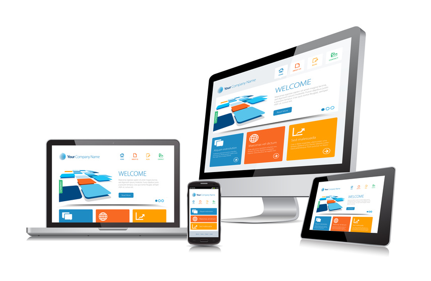
One of the most remarkable ways to create visual hierarchy in web design is through repetition. This entails using certain elements and styles repeatedly throughout your design. Repetition leads to consistency, which, in turn, keeps the users glued to the screen.
Not to mention, repetition can reinforce branding. Using your logo, brand, colors, and typography can help strengthen your brand identity. In this regard, repetition can help users recognize and recall your brand, creating a more cohesive user experience.